
Rebuilding a
Mission-Critical Application from the Ground Up.
United Parcel Services (UPS) is a well-known industry leader in the logistics business spread over 220 countries on six continents, with a record of delivering over 21 million packages on an average day.
Service
Print, Art Direction
Client
UPS
Year
2019 - Current
💥 The Overview
— the backstory
In 2019 May, I associated with Conduent as a Lead UX Designer and was positioned in the UPS Modernization division.
Conduent has nearly two decades of association with UPS on leading many business applications of different entities. From a technological standpoint, UPS has identified a few mission-critical systems that necessitate redeveloping from scratch that should be equipped to bear the company's hyper-needs.
💥 The Opportunity
— What's it all about?
The International Document Imaging System (shortened in initials as IDIS) has top's the list of criticality. The IDIS operates as a comprehensive front face for all the images and data index keys generated/uploaded within packaging and delivery transactions, which helps UPS to troubleshoot/track information down the line.
The application was developed nearly 17 years ago, considering the needs at the given time. But with solid business growth and demand, IDIS application has been toiling to scale, causing reliability and performance issues raised substantially to the peak. Running on Aged/Legacy Technologies and Database environments is one reason, and usability problems that require drastic improvements push its modernisation in the first place.
Problems
Slow
Reliability and performance issues raised substantially to the peak.
Outdated
IDIS application has been toiling to scale irrespective of solid business growth and demand.
Malfunction
Usability problems that require drastic improvements push modernisation in first place.
Goals
Fast
Raise the application performance that could handle most critical usage.
Modern
Make it innovative and personalised to operate for everyone, everywhere.
Functional
Make the application capable enough to match the business relevance.
Opportunity
How might we make the system
FAST, MODERN and FUNCTIONAL?
👨💻 My Role
— as a Multidisciplinary Lead Designer
I design-led the IDIS project with a team of four. I collaborated with Stakeholders, Product Owners, Managers & the Cross-Functional Scrum Teams to plan, research, define the scope, and execute.
My efforts to ensure all the business/user needs have been engraved within the technical and delivery constraints.
01
Strategy & Vision
Strategy and prioritization of the roadmap to decide how and what to migrate to the new system. I planned & shape-up a measurable design approach that could accomplish faster and more valuable results; ultimately avoid conflicts.
02
Uncover Insights & Conceptualise
I initiated research activities and conducted workshops involving potential users, stakeholders & Managers to conceptualise designs.
03
Execution & Validation
I produced user flows, wireframes, mock-ups, prototypes and design specs with other designers. I directed measuring exercises to ensure we are in the right direction that is intact with modernisation goals.
04
Oversight & Coordination
I gained a rigid passageway among teams by documenting our design elements and strategies to alleviate our decision‐making methods.
Exploration & Research
— The plan is to go ahead!
In my personal experience, redesigning & modernising legacy applications is an art! The origin should be to audit the existing system thoroughly, Learn the business use cases, and evaluate the risks, potholes, and possibilities.
Assemble all potential knowledge and translate them into new requirements. It demands a series of collaborations, validations and iterations with stakeholders and users toward agreeable terms.
UPS is a large organisation solving complex problems, and the internal applications are data thick.
Cross-Pollination Framework
— make connections, take note of similarities, and find inspiration
To estimate the timelines and scope, I initiated a knowledge-sharing activity with the in-house team involved with Project managers, and analysts to estimate & familiarise them with our current understandings and avoid gaps.
We also started interacting with the UPS business team to audit the present application status.
The insights of the above collaboration:
➔ Insignificant information - Although Conduent developed it earlier, we have negligible information on its full view.
➔ Gaps in our understanding - We recognised gaps in our understanding of application usage, i.e. purpose of a few reports, irrelevant index keys & potholes.
➔ Deals with various verticals - The application deals with multiple verticals, So the usage is not limited to one user hierarchy, country, or group.
➔ Contextual inquiry - UPS agreed to let us conduct a Contextual inquiry on the application pain points from a technical and non-technical point of view.
➔ Research plan - We presented a 4-week initial research plan on tackling this further with its expected results.
We handpick three research methodologies within our time, scope and budget.
✅ Surveys: Prepare a set of workflow and usability questions and ask for constrained or honest answers.
✅ Contextual Inquiry: A blend of observations and interviews with handpicked users from surveys.
✅ Usability Testing: This includes A/B testing with existing and new ideas.
Gaining insights
— quantitative/quantitative research
As a next step, we ran large scale surveys with a mixture of qualitative/quantitative inquiries on the application experience. We tailored questionnaires to be general and focused on aspects raised by our cross-functional teams. Based on likenesses, I mapped everything distinguishing metrics such as:
-
Scope Of Improvement (SFI)
-
Usefulness measures a system’s, or a application, capability to perform a certain task.
-
Errors occur due to congestion and inaccurate precedence.
-
Easiness to accomplish tasks.
-
Ability to discover information in a conventent way
-
Assure the user to be in control of what is happening.
This step is significant for us to plan and prioritize the Contextual Inquiry with the users near future.
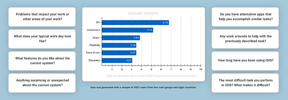
Sample questions & Data generated from the initial research exploration survey.
Hypothesis based on the data gathered
🟢 There is one clear indication that the scope of improvement is required.
🟢 The overall Usefulness of the application got the passing score; perhaps we could discern it's doing the job reasonably well even within the constraints.
🟢 The majority of applications pivoted around searching and discovering information, and it's no surprise that the Discovery metric has taken the biggest hit.
🟢 user Quoted, "There is a lack of visibility when an issue is going on and that causing Errors in the workflow." reversible
Overall, The results aligned with our initial exploration and gave us a lot of confidence in our approach to go further.
〝There is a lack of visibility when an issue is going on and that causes Errors in the workflow〞
— an admin user
Interactive collaboration
— contextual inquiry
So far, with the prior workshops and surveys, we have gained excellent knowledge of the part IDIS plays at the operational business level (basically how everything is connected) as well as the pain points, improvement and anticipations from both groups.
One of the best things about working on the internal applications is that the users will be somebody operating within the organisation with specified positions and workflows. In many ways, they will be well qualified to provide us with a sounder perspective on the hardships they face in the existing workflow.

Data was generated from the initial research survey and impressions from usability evaluation.
Our strategy is straight-forward
We asked our users to describe and demonstrate the daily tasks and the search patterns they use to generate reports and audit images. Allowing them to explain the frustrations, red flags, and alternative hacks they do to overcome.
Our objective is to observe & understand!
Our objective with this collaboration is to dig into the features, sub-features, functionalities, and nitty-gritty aspects. We decided to cover users from all groups and geolocations within a designated time frame. — no luxury to play around with ideas.
〝There is a lack of visibility when an issue is going on, and that causes Errors in the workflow〞
— an admin user
🔥🔥🔥 The challenges and outcomes of the above collaboration:
➡️ I am relieved that we completed the early-stage research per our schedule.
➡️ One thing that made me nervous and excited was that we lacked with a lot of domain familiarity to address the gap between complexity and possibility.
➡️ Overall, the experience of talking to our users was mind-altering for us to estimate how chaotic the application was performing.
Analyzing and synthesizing user research data
The data is abundant, and now, the challenge is to break down the information. There are many new functionality requests, functionality facelifts, technology updates behind the scenes, etc.
With the help of an internal focus group from different disciplines inside the project, I initiated a few brainstorming sessions for analysing and synthesising the data. We understood that achieving everything would significantly impact our delivery timelines, so we trimmed and prioritised the scope.
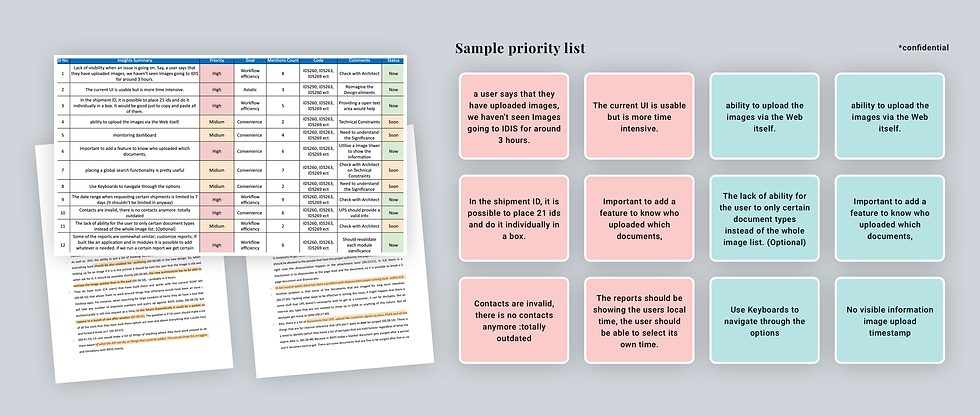
Task criticality x impact x frequency = severity.
Wait, What are we up to?
— On a Hindsight
The application is data concentrated with many unorganised reports and functionalities. With many collaborations & communications. Below are a few of the many spots I tried to narrow down that needed significant refinements or workarounds.
01
Invalid reports with no clear justification.
There are nearly 40 reports in the application; surprisingly, many were unused and irrelevant to justify the requirements. It's raising concerns about the rationale of the application.
02
Mismatching results are creating a clueless impact.
After running a query, the results that appeared should match the users’ intent or use case. When parameters are not related to the context and yet emerge with null or invalid data makes the user clueless.
03
Missing features are rising manual work.
For instance, nearly thirty thousand users are associated with the system divided into seven groups across 177 countries. Everything should operate handly when something needs modification or fixing, not manual backend work.
04
Imperfect prioritisation beats down the performance.
An essential element like adding an asterisk to mark required fields and tailor them according to utilisation context dramatically affects the performance.
05
Inflexible functionality affects productiveness.
For instance, nearly thirty thousand users are associated with the system divided into seven groups across 177 countries. Everything should operate handly when something needs modification or fixing, not manual backend work.
Indeed, I sensed a great combination of limitations and opportunities could coexist.
😀
The Output
— Complex challenges meet practical solutions.

Every change happened with purposeful collaborations involving multiple stakeholders, contextual inquiry and iterations. Below are some random improvements on a high level that essentially lifted the system efficiency.
〝The current system is usable but is more time intensive〞
— a user

How We Got There!
— A little behind the scenes
We have suggested/made several changes that could upscale the current experience of the application. There were many limitations on improvements as it's a revamp of the existing system, and a prominent workaround would create a significant cognitive load on the user adaptation. We are very thoughtful on the implications side as well.
It's a revamp of the existing system, and a prominent workaround would create a significant cognitive load on user adoption.
01
A refreshing new look makes everything
upbeat & contemporary.
— a brand new look.

〝Personally, I feel; IDIS Website is Outdated; it's 90's style〞 — a user quotes.
The application was designed and built multiple years ago; if we chose to redesign the experience, It's no brainer that we should begin with the interface first. I want to provide a brand new look to the whole application.
Still, I am initially worried that UPS wouldn't authorise us to accomplish this since many internal applications matched the same brand guidelines. GLADLY, when I pitched them, they were open to making the necessary changes to make it contemporary.
UPS has an internal monitoring design team that manages all the enterprise style guides & assets to ensure consistency across the internal platforms. I closely associated with the team and worked together to redevelop a brand new design language.
The new design specifications guidelines will later heed all further critical applications in the revamp pipeline.
02
Invalid reports with no clear justification.
— Optimise everything.
During our discussions with users, I faced an intriguing experience with one specific user. Being frustrated with the current solution offering, he started questioning and pointing out weird things in the application use-cases; unexpectedly; we were clueless about many items.
We faced many similar situations during conversations with users, making everything engrossing.
The ruined discovery experience.
There are nearly 40 reports; surprisingly, many were unused and irrelevant to justify the current conditions. Some reports and functionalities are built for specific locations or user groups, but they are visible to everyone because of the poor roles and feature prioritisation. It's raising concerns about the rationale of the application.
The other problem is the results pages; After running a query, the results should match the users' intent or use case. We identified that some of the information displayed on the result grid is unsuitable for the context yet emerges with null or invalid data —the ruined discovery experience.

〝The objective was to shrink the excessive clutter and make it seamlessly work to the desired intent of the user and business.〞
We determined to deconstruct and reconstruct every report.
There was probably a ton of thinking and research to create the existing reporting mechanism. Our goal is to inspect the current design and carefully understand how it works and the intention behind each decision. It is a practical yet tedious procedure, but it will be the only path to understanding it at a use-case level and building it back.
To do so, We break down every report into Index key levels and lay it over on an excel sheet and investigate the purpose it's delivering. I closely collaborated with numerous subject matters and stakeholders to figure things out. The fun came from communicating with all stakeholders and users, mixing ideas, taking cues from other products and hand-pick elements that fit the flow.
Too many reports were putting too much cognitive load on users. Some reports were almost the same, so we merged a few.
The modifications we made are subtle, perhaps hidden at more visible notice. But, It enriched and boosted how operations/users could utilise reports skillfully.
03
Missing features are rising manual work. 🙄
— Let’s build something from scratch!
Problem use case:
Nearly thirty thousand users are associated with the system, divided into seven groups across 177 countries. Everything should operate handly when something needs modification or fixing, not manual backend assignment.
It will increase the scope of our delivery plan, but we decided to do it anyway.
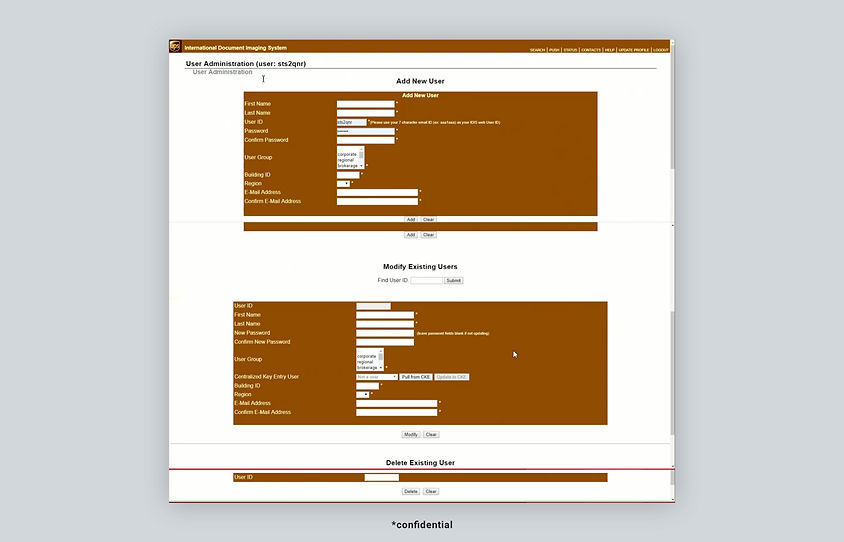
During the walkthrough and brainstorming of futures, I identified managing users and roles (Simply user management) needed a complete workaround. Adding, editing and deleting user information required a hectic back-end process with no system visibility.
Suppose something has to manage from existing details of the users or privileges. The authorised person has to raise a ticket to the support team and retrieve the user ID information because everything is driving through the unique id with no tracking. UPS has little to no control over this module which creates a dependency.
It also impacts different application areas with many chances for a security breach. It will undoubtedly increase the scope of our delivery plan, but we decided to do it anyway.

We identified many possibilities
We want to build the apparent solutions that could optimise the existing process. But It was not as easy as we thought. We identified many possibilities when we attempted to look back and conceptualise how it worked.
► We built a centralised Azure Active Directory SOS auth method that enables users to securely authenticate with multiple applications and websites using just one set of credentials.
► We provided UPS admins with a list of users associated with the system to seamlessly manage and perform bulk actions.
► UPS admins could manage roles, countries, buildings, and regions simultaneously.
► Admins could pull, sort, and filter users from different paths and make bulk role changes to a particular group.
► We prioritised everything, divided them into sub-modules, and made them work and operate as individually as possible.
Our objective is to give more control and flexibility to UPS.
04
Imperfect prioritisation beats down the performance.
— Design is only good if it works. This sounds obvious but is hardly practiced.
Image Viewer — Disregarding prioritisation beats down the experience.
Image Viewer functions as a mutual facilitator for the entire reporting mechanism, but it has been completely overlooked in legacy. The majority of the user spends their time auditing images from different sources. It lacked many additional features that led them to opt for workarounds and hacks that might cause security violations.
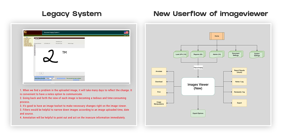
We reimagined it for modern times. Regardless, I suggested a significant workaround, yet many team members meant it would create a significant cognitive load on user learning. We carefully redesigned the feature that saves time and adds value to our users with the common grounds.
After rigorous testing and iterations with multiple options and components included, we built an image viewer that looks elegant and functional. There is so much potential to improve it; even today (when I am writing), we are still improving it according to the feedback as enhancements.

To be straightforward!
-
The primary goal is to use maximum screen space for a great image viewing experience.
-
We added more additions by providing a toolbox to manipulate and modify images.
-
Initially, We A/B tested different interface versions to evaluate the pros and cons.
-
Based on the feedback, I made various iterations and here is the not so final version.
Based on feedback and reviews, even today (as I am writing), we are still improving it whenever we discover possibilities.
Sometimes, Adding an essential element like an asterisk to mark required fields and tailoring according to utilisation context positively affects the performance.
05
Detailed Design
— Explaining to the non-design teams the value of user experience is tricky.
Documenting Design
Our team outspreads across various time zones and locations, which means design decisions pass through many teams (non-design teams). The biggest challenge is communicating empathy and understanding, considering each team's viewpoint. Explaining to the non-design teams the value of user experience is tricky.
There are many possibilities that misinformation will create disorder when dealing with complex problems involving many details. Thorough and deliberate communication plays an essential role in keeping everyone on the same page. I consider sharing every piece with equivalent priority will be crucial to our success.

Documenting our design creation has evolved into a vital part of the project and instantly impacted outcomes.
Work on design documentation incrementally.
I anticipated that documenting our design journey clearly would avoid uncertainty and enhance clear communication and a great design handoff experience for cross-functional teams. It motivated our team to answer the questions, "How do we want to build this?" and, importantly, "Why do we want to build this?"
We closely collaborated with product owners along the way of our process. Incrementally, we document the journey in a predefined manner with all the rational use cases and insights from a business and user perspective. Later, the documentation will be materialised into complete business requirement documentation in the subsequent stages.
☄️ The Impact
— Let's measure what we have achieved!
✅ Improved the system usability
We have improved the system usability from 39% to 62%, Which is satisfactory at the prototyping stage. This score will leverage the final impact significantly.
The scorecards encouraged focus groups & stakeholders on gaining assurance; clear signal direction to meet project goals.
What our users said!
Below are a few notes from our customers after using the fully functional and integrated platform.
❤️
“What an upgrade! Looks very clean and intuitive" — beta user from UAT environment
"I can notice many updates at my first glace, really like it overall but excited to see new image viewer" — beta user from UAT environment
"Been waiting for a long time; I can't believe to see the new IDIS update that exceeds the limitations." — beta user from UAT environment
🥰 Some of the noteworthy mentions!
— From the internal team, managers & stakeholders
I collaborate with cross-functional teams of clients, managers, and leads to evaluate requirements daily and weekly. My everyday job is to maintain a good relationship with meaningful empathy to solve problems; we often debate with each other about the best possibilities of the solution. Often, Gathering feedback would help me stay on the right track with everyone and help me evolve as a designer.
Below are some of the noteworthy mentions among them.
🔥 Kiran is an exceptional UX talent who truly seeks to understand every aspect of the user base. As a member of our vendor's team tasked with updating an outdated internal business system he was able to understand the complicated, and sometimes poorly expressed, concerns of our users and develop streamlined solutions. Kiran is particularly capable at serving both the client and his own employer in developing the best possible solutions. He is a joy to work with and makes any project easier.
— Zach Rellstab - Package Process Management at UPS
🔥 Kiran has exceeded expectations as a UX Designer. He quickly stepped in and alleviated the customer's fears with his ability to communicate and deliver. Kiran did an excellent job of recognizing what was missing. He also stepped up in leading by example to others on the team.
— Danny - Platform & Solution Engineering Director
🔥 Kiran and I have worked together for over a year on a big project to modernize the most mission-critical system of one of Conduent’s larger clients. Kiran is a dedicated and talented UX designer who has garnered the praise of our client because of his ability to incorporate their UX practices and make the solution intuitive to meet their customer needs. Kiran's enthusiasm and drive for UX research is remarkable; I am excited to have Kiran on our team.
— Brad - Client IT Manager at Conduent
🔥 Kiran is an excellent result-oriented person with amazing designing skills. He understands the customer's needs. Talks to them to get their point of view and goes about his designs. He drives the discussions with the customer. Having worked with him closely; I am very confident of his technical skills and ability to deliver according to the customer needs.
— Jaga Mohan Modekurti - Project Manager
Key takeaways & learnings
— What Worked Out Well? & What could have been better?
👌👌👌 Our research activities are distinctly well-defined
Being involved early helped me designate an outstanding balance between data and theory with a user-centric and data-driven approach. It played out well to understand everything better and improve our quality of decisions and outcomes. It benefited greatly to sharpen my facilitating skills with learning possibilities. We have utilised the power of well-defined research activities to match timelines, which worked out well in the end.
👌👌👌 Asking many questions protected a lot
UPS is a large organisation solving complex problems, and the internal applications are data thick. Revamping the applications with a chaotic scale required a deep understanding of many domain competencies in package management. It's always challenging to understand the problem use-case breadth and depth to discover opportunities; asking many questions protected a lot. Over time, I sharpen my knowledge skills to have a pleasant conversation about solutions. It requires extra effort to communicate clearly with people from distinct verticals.
👌👌👌 Data-driven process and measurable metrics
Nothing's possible without the potential leadership team that encourages us to achieve great results. Gladly, I had an opportunity to work with a team who strongly believes in "If you can't measure it, it didn't happen". From the beginning stage, we resembled a spirit of the data-driven process and measurable metrics that could help us to calibrate the success of our UX efforts.
👌👌 Multiple discussions and an approval process
Frankly, the stakes are high with this project. Every modification or addition needs to go through multiple meetings and an approval process with different leads. Explaining attributes with a strong viewpoint by maintaining empathy even in a tight timeline is sometimes a tedious experience. Sometimes it worked out well, and sometimes not. However, I gained my fair share of learning to tackle it over time.
👌👌 Left with many potential opportunities to improve.
We still have potential improvements passed over as they came with the technical constraints, or solving them will lead to new problems/use-cases. We logged into the backlog for our future considerations. I hope they will see the light someday.

✨✨✨
Thank you for your time & attention!
I would love to hear from you, whether you just want to shoot something casual or discuss a potential opportunity to achieve great things together.
Feel free to drop me a message by clicking the button below
[or] an email kiran9rathod@gmail.com