Empowering SMEs to Manage their Retail Needs Efficiently
A SaaS-Based Cloud Point of Sale System.
Role: Senior Designer
Impact: 52% Conversion Rate From Trial To Purchase!

Overview
During my nearly year-and-a-half tenure as the Lead UX Designer at Valuelabs, I had the privilege of being part of an ambitious project that not only broadened my skillset but also provided me with invaluable insights.
I'm eager to recount my journey and the remarkable outcomes that our design approach produced. However, it's essential to acknowledge that specific information gaps exist, intentionally, due to the sensitive nature of the product and privacy concerns.
BillinPOS — A Saas-based cloud Point of Sale System Empowering SMEs to Manage their Retail Needs Efficiently.
What was my role and responsibilities?
Throughout the project's inception and its successful two-phase launch, my role as a Lead Designer was characterized by a blend of strategic insight and meticulous execution. I had the privilege of guiding a team of four highly skilled designers, and my primary focus centred on enhancing features related to sales flow, product management, inventory management, and report curation.
However, as a design lead my responsibilities extended beyond these specific product features, encompassing a broader spectrum of activities:
Execution and Validation
I am responsible for the deliverables involving flows, wireframes, and prototypes. I am also responsible for logging and addressing feedback from various sources and prioritizing tasks. I played a key role in designing critical modules such as Sales, Product, Onboarding, and B2B, and conducted multiple A/B tests with power users to create a seamless experience.
Product Discovery
I led product discovery by facilitating discussions, conducting observations, and collaborative workshops with stakeholders and focus groups. I played a key role in validating and exploring ideas through active user research and benchmark analyses, forming the foundation of our discovery process.
Oversight & Coordination
Our creative process was a collaborative endeavour. In addition to improving the product itself, I ensured seamless collaboration with developers and QA by communicating behind-the-scenes design ideas, specifications, and guidelines. This guaranteed meticulous implementation without compromise. I also played a key role in UAT demos, allowing end users to gain invaluable insights.
Finding the Mutual Fit
Discovery & Analysis
The early days are all about finding the mutual fit between the business, product, and users. Gaining a deep understanding of the product's domain, setting expectations, and defining success objectives, and milestones.
Although the project's origin is in Dubai, a team of executive stakeholders travelled to our work site to launch it. I collaborated closely with them to collect essential information about the product, objectives, and user interactions, which were quite extensive. The product requirement documentation deliberately includes gaps that prompted us to reassess our understanding. While the process we followed might not have been entirely linear, our commitment is to ensure that we deliver a product of superior quality. Let's quickly review what we've comprehended to enhance our clarity and direction:
Discovery & Analysis
One—About the Business and the opportunity.
Quick Fact — Axiom is strategically positioned to cater to a diverse customer base, encompassing the lower-end market, wholesale distribution, and retail sectors.
Axiom is a prominent telecom retailer in the UAE and Saudi Arabia, boasting 120 branches and selling points, along with an extensive network of 4,000 indirect sales channels, of which 2,000 are directly managed. Additionally, they maintain a robust online presence to serve end consumers.
Axiom has established a comprehensive micro-distribution network, which plays a pivotal role in logistics and the supply chain. This network involves approximately 80 deliverymen utilizing vans to service thousands of small retailers across its operational regions, contributing significantly to the company's sales growth.
In addition to its wide range of product offerings, Axiom provides an array of services, including after-sales care, credit line lending, insurance, mobile device refurbishment, device customization, and more. This strategic positioning allows Axiom to cater to a diverse customer base, spanning the lower-end market, wholesale distribution, and retail sectors.
What prompted Axiom to create a POS (Point-of-Sale) system?
Axiom always aims to be a one-stop shop for their partners, constantly seeking ways to empower and support them with everything they need. They recognized an opportunity to develop a Point-of-Sale Software as a Service (SaaS) solution that seamlessly integrates with their current service offerings. Given their years of experience and excellent reputation, they believed this was a strategic move. Furthermore, there are a few reasons why they decided to build a POS system:
Introduction of Value Added Tax (VAT)
VAT was introduced for the first time in Saudi Arabia and the United Arab Emirates, requiring businesses to manage their finances regularly. Axiom saw this as a way to stand out from their competition and offer something valuable to their customers.
Seamlessly Integration
Axiom believes that by offering a range of products and services that work well together, they can make their customers' experience smooth and consistent. When customers like one product or service, they're more likely to try others, helping Axiom grow.
Build Services Around POS
Creating a POS system can help Axiom grow and keep doing well over time. They can adapt to new trends and offer a variety of services around the POS, which sets them up for long-lasting success.
Discovery & Analysis
Two—About Product Space & Vision.
Quick Fact — BillinPOS is not aimed to revolutionize the POS landscape; instead, its mission is to address specific challenges for its partners within the electronic retail domain.
In our daily shopping routines, we all encounter Point of Sale (POS) systems. Whether we're buying a coffee, trendy sneakers, or the latest iPhone, the purchase experience remains consistent. A cashier or sales executive scans the product, processes payment and contact information, and provides us with our purchase and a receipt. This seemingly simple process represents only about ten per cent of the overall functionality. Many components must work cohesively for the sale to be effective.
In today's world, POS systems play a critical role in enhancing business revenues and operational visibility, making them almost a necessity for running a successful business.
POS systems generally fall into two categories: traditional native hardware-dense and web-based cloud POS. Each one has its advantages and disadvantages, and the choice between them depends on the specific needs and priorities of the business. However, many small and medium-sized businesses today are opting for web-based cloud POS applications due to their flexibility, accessibility, and lower upfront costs.
This is where BillinPOS shines. We are offering a SaaS-based platform to assist our partners in making a smooth and convenient transition to cloud-based business operations. BillinPOS isn't aiming to revolutionize the POS landscape; instead, our mission is to address specific challenges for our partners within the electronic retail domain.
Discovery & Analysis
Three—Who Are the Users and Whom Are We Building For?
We collaborated with partners of various sizes, spanning single-store proprietors to multi-store owners, each with their unique scales and operational methods. However, we are deliberate in our approach, focusing on specific user groups while maintaining an overarching goal of making our product accessible to a broad audience. Our initial emphasis is on serving these distinct user groups to lay a solid foundation for our journey from 0 to 1.
Here are two identified user profile groups, each with their backgrounds, goals, and expectations:
The information provided below is intended to offer you a high-level overview, giving you a glimpse of who the users are, their backgrounds, and expectations. In real-time scenarios, it may not be as comprehensive as presented here.


What We Have Designed
The Output
We spent seven months designing and iterating before we released the first version of BillinPOS. Since then, we have adopted an iterative approach to design, which helps us shape features that are tailor-made for our users. We launch features and improvements incrementally, based on the feedback and reviews we receive. Here are a few mock-ups to give you a glimpse of our work.


A Glimpse of Our Idea Curation and Visualization Process
We created workflows for a few complex functionalities to precisely validate the ideal steps and journey of accomplishing a specific task. This helped us to validate things on the spot even before creating wire-frames. We heavily relied on wire-frame-based information hierarchy and prioritisation for the complex modules like sales, product, and inventory features. This helped us to iterate and validate multiple versions with stakeholders and focus group feedback.

What I have done.
Key Contributions
Quick Fact — Axiom is strategically positioned to cater to a diverse customer base, encompassing the lower-end market, wholesale distribution, and retail sectors.
The product underwent multiple iterations at each feature level, guided by continuous testing and feedback loops. Even during the development stage, we made various adjustments and refinements to align with our desired objectives. It's challenging to encapsulate everything about it.
Instead, I'd like to spotlight a couple of features that were successfully rolled out and brought me great satisfaction and enthusiasm. We designed them through a user-centred approach and a design thinking methodology with well-defined objectives and outcomes. Naturally, relentless curiosity and instincts played crucial roles in this process.
Key Contributions
Sales: The Key Factor in Shaping the Customer Experience.
Sales play a prominent role in shaping the overall POS experience, and it can either make or break it. As a designer, it is my responsibility to thoroughly understand and evaluate every use case to design an effective sales flow.
Let’s understand the fundamentals. How to Design an Effective POS System?
An efficient and satisfying Point of Sale (POS) system requires seamless integration of two core components: inventory and sales. The inventory module ensures accurate and timely management of products from suppliers to customers. The sales module enables smooth and fast transactions with customers. When these two components work together, they reduce errors and losses, resulting in a high-performance POS system.
Many data points in the product, one way or another, are derived from the sales screen inputs. No doubt, it should be considered a principal module.
Understanding the Sales Process & Challenges
We started our design journey by focusing on the sales flow, using a reverse engineering approach. As a designer, I learned about the role of a salesperson by engaging in interactive conversations and walkthroughs.
We also prioritized understanding, especially regarding user-friendliness and accuracy. We realized that both speed and accuracy are essential for creating a delightful sales experience.
I gained insights into:

Accuracy and Speed Lead to Customer Satisfaction
Cashiers, store owners, and sales associates are the main users of the sales screen, interacting with it often. The product information on the screen serves as the ultimate source of truth, enabling precise and efficient transactions. Our system informs users of any changes, such as price adjustments, ongoing discounts, or relevant promotions, in real-time during the sale.
Moreover, even though end customers don’t directly use the POS system, they indirectly experience the sales process. Errors and delays can be costly and damage the business’s reputation. Therefore, ensuring a seamless and accurate sales process is vital for both the business and its customers.
I understood that speed and accuracy are crucial in making the sales experience delightful. But how? Let's figure it out.
A/B Testing: Using the ‘Design Light, Validate Fast’ Approach
We reviewed various user journeys, design languages, layout styles, and information architecture through lean design critiques. We had engaging and thought-provoking discussions, identifying key differences and patterns. These discussions raised some questions that needed clarification to set a clear direction for our project.

Retro vs. Minimal Layout Styles and Visual Aesthetics
We found two distinct layout styles. We want to explore which one might be the best fit for our purposes. The first style is the Modern interface, which has a minimalist and sleek appearance. Elements are designed to be unobtrusive, and their functionality is clear in their usage.
The second style is the Retro style, which is more engaging. It has a deliberate design approach and upfront visual cues to prompt actions. These layout styles are seen in native applications, where all available space is fully used for enhanced functionality.
We genuinely believe there is no definitive right or wrong choice between the two. Each design language holds its significance, and our goal is to discover what suits us best. Therefore, we have decided to conduct A/B testing with these two design approaches to discern our users' natural inclinations. All our efforts are geared toward gaining insight into the direction we should pursue.
Our Design Decisions
We made three different design flows, each with a unique interactive journey and design aesthetics. We tested two of these flows with our focus group, as they seemed the most distinct and suitable for our hypothesis. We left room for open feedback with open-ended questions.

Testing Assumptions & Collecting Feedback
We tested these flows with random users from our predefined groups. We asked them to do various sales-related tasks, such as searching for products, adding items to their sales list, reviewing payment details, adding or searching for customers, and completing transactions with different payment methods. We also asked open-ended questions to know their preferences and their ability to follow visual cues. We also shared Invision prototype links with various users and stakeholders for their feedback.
We noticed that most responses favoured the first option. This was mainly because of its open layout style and clear visual cues, which improved usability and resulted in a positive task completion rate.
This activity helped us confirm our design preferences and also gave us useful feedback and feature requests, such as:

We added these suggestions and new features in the later stages, following a user-centred design approach. We made many iterations that resulted in a simple and usable user experience.
Key Takeaways
At first, I wanted to go for the modern and minimalist approach, thinking it was the best choice. However different perspectives made me explore various flows and design methods for the sales, payment, and receipt generation journey. This took a lot of effort and time, but I was sure it would reveal deep insights into our users’ preferences and capabilities.
Personally, this process has taught me a lot about our users’ identities and their unique needs. The feedback we collected has been a strong basis for our decisions as we go through the changing project landscape.
Key Contributions
Onboarding: How We Improved the Onboarding Experience.
If users struggle to grasp the product, they may either discontinue using the service or migrate to a competitor.
The Gamble That Could Doom Our Product and Users
As we finish major modules like product catalogues, inventory, and sales, we focus on the onboarding as we start the product deployment phase. Leaving users without guidance, and expecting them to navigate on their own, is a risky strategy that could make them quit and never come back. This could turn our product into a ghost town of disengaged users, leading to service interruption or migration to a competitor.
We know the importance of a seamless onboarding process, so I took the initiative to identify, analyze, and establish a strong onboarding strategy. The goal is to empower our users, making sure they quickly find success with our product and become invested and paying customers.
Here are some goals that helped me stay focused:

Identifying and Analyzing Onboarding Patterns
I did extensive research on various products and the art and science of creating seamless onboarding, to find the best way to guide users through an engaging onboarding experience. While there are many ideas and approaches, we stay clear on our focus areas to find solutions that are not only useful but also feasible to implement and test quickly, given our technical and time limits. Everything is driven by pre-defined goals and motivations to solve for a purpose.
We also had collaborative sessions with stakeholders and focus groups to understand the ideal choices, making sure they align with our technical capabilities and time parameters. After thorough research and discussions within the team, we identified a few onboarding patterns to consider for our product.
The objective is to empower our users, ensuring they swiftly find success with our product, making them more likely to become invested and, ultimately, paying customers.

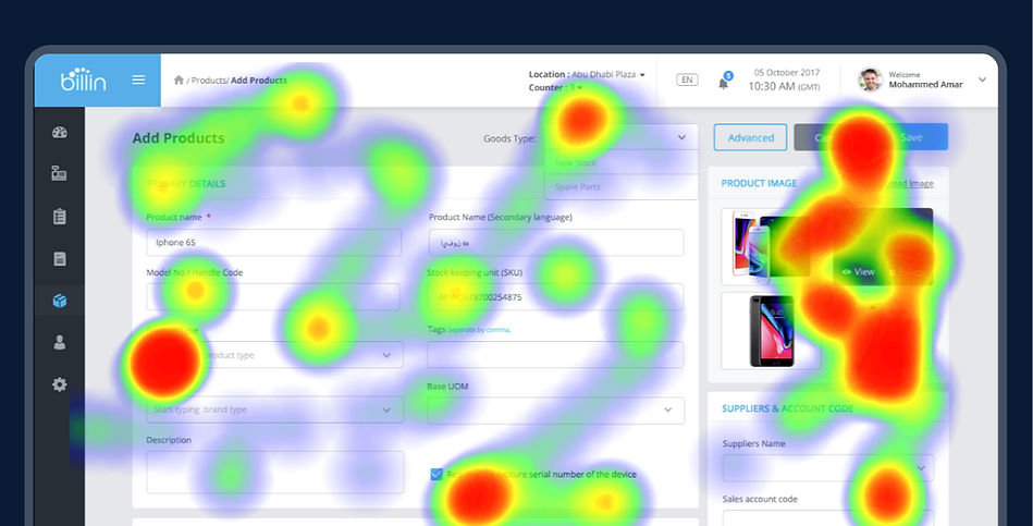
Getting to Know Our Users Better!
We added a cool tool to our toolkit – a digital detective. This tool shows us how users interact with our product. It creates heat maps and patterns of how users move around. It’s like seeing what users do behind the scenes. We check how long they take on tasks, where their mouse goes, and their journey. It’s magic for understanding user behaviour!
After we launched our product, we checked how long it takes users to do things. Like signing up for a store, adding locations and items, and making their first sale. We want to make it smooth for them.
We designed a simple onboarding journey – just 1, 2, and 3 steps. We guide users through the important stuff first. After they sign up, we expect them to follow our welcome page steps. Most users explore everything, which is great. They take the initiative to learn our product.
We Faced a Challenge: The Rise of User Dropouts After a Brief Exploration
Some users stop exploring after a quick look. It caught our attention when the counts went up. This could affect how many users stay. So, we dug deeper to understand why some users quit early.
With a quick discussion to get some feedback on their impression and value, we understood they felt underwhelmed to understand how everything works. This user group mostly falls into The “Late to the Party” which we identified earlier. This gave us some challenges to keep their motivation to finish the onboarding journey. Because the onboarding process is critical for setting up users for success with our product.

I Found a Key Insight: Positive Outcomes from Our Improvements
Our users wanted a tangible understanding of how our product works. What if we could offer them more than a theoretical overview—what if we gave them a hands-on experience, a sneak peek into the functionality of our product? This idea struck me during an analysis and exploration of existing products, aiming to create an exceptional onboarding experience.
I presented the idea, outlining the parameters for its success. The result? A set of new components that met and exceeded our expectations. Let’s dive into these game-changing features.

These considerations changed the entire user experience, improving the speed and efficiency of onboarding. Users liked these improvements, finding a more intuitive and engaging process. The positive feedback came in, confirming that these features played a key role in enhancing the user experience.
Our Achievements in Numbers
The Impact
Positive Conversion Rates
We started as a pilot project to create a POS system that integrates with existing services and helps partners run their businesses smoothly. We focused on understanding their expectations, needs, and challenges. Our main goal was to make the system simple and user-friendly.
We achieved our goal, as our partners’ feedback shows. Of the users who tried the product, 52% agreed to pay and keep using it. This shows that our partners trust our solution.
We are proud of our achievements, but we are also ready to improve and adapt to new needs and challenges. Our users’ testimonials show the impact we’ve made:
Post-trial period, Nearly 52% of users are willing to pay for the product and continue using it.
"BillinPOS facilitated our digital transformation seamlessly, without disrupting our established business style. It operates with simplicity and enhances both product vigilance and customer engagement." — feedback from a partner via survey.
“Switching to the new POS resolved the pain points we faced with our previous system, notably the lack of regional customer and language support. Testing it as a sideline, we found it aligns perfectly with our expectations, and we are eager to continue its use." — feedback from a partner via survey.
"Billin POS has significantly reduced the time spent reconciling stock discrepancies in our stores, allowing us to focus more on customer engagement."
— feedback from a partner via survey.
"The new POS is user-friendly, affordable, and frictionless. It has helped us maintain an organized store, with control over sales, purchases, and cash management." — a note from a partner during the demo.
Retrospection
Personal Impressions & Reflections
One Size Doesn’t Fit All.
I thought the project was not challenging or interesting at first. The product space seemed mature and well-developed. I wondered what could be improved. However, after some research and insight, I realized I had ignored the user context and demographics from Dubai.
This became clear in the design workshops with stakeholders. I had not understood the importance of user and demographic differences. Every product has its context, challenges, and expectations from users, constraints, and demographics. I soon saw the mistake in my first impression.
The lesson? There is always a chance to improve and try new things, especially for each product’s unique situation. Intentions and context are key to any product’s success.
Documenting Matters!
Designers often face tight deadlines and constraints that limit their creativity. I know this well. Iteration happens based on feedback, insights, or experimentation. Documenting and keeping these notes at the feature/screen level can improve cross-functional collaboration. Otherwise, questions like “Why did we do this?” and “What were the goals and reasons?” can make collaboration difficult.
PRD/BRD documents help, but they miss the empathy and insights from the designer’s view. This gap has made us unsure about past decisions.
The lesson? Keeping a design journal for research and design work, along with a tracker, can boost confidence and help retrospection as time passes quickly.
The end is just the beginning.
We build the best experience for our customers, but that’s not all. We have big dreams for this product, but we can’t do everything at once. Budget, time, and constraints made us focus on what matters to our customers and the bottom line.
Competitors are doing more, offering online and offline features. Today’s POS is more than a cash register; it’s a multitasking machine.
Our mission? BillinPOS is not here to change the whole POS scene; it’s made to solve specific problems for our partners in the electronic retail domain. We did it, given the circumstances. BillinPOS? It’s a hidden gem, ready to shine brighter —especially for the global market.
Feedback Keeps Me on the Right Track!
Noteworthy Mentions!
I use feedback from my managers and mentors to grow. I work with cross-functional teams of clients, managers, and leads to evaluate requirements daily and weekly. My job is to maintain a good relationship with empathy to solve problems; we often face conflicts of ideas for the best solutions, but I ensure keeping everything respectful and trustworthy.
Feedback helps me stay on track with everyone and improve as a designer. Here are some of the positive feedbacks that made me cherish.
🔥 🔥 🔥 Kiran is a highly intelligent, innovative designer who can bring your ideas into designs. He was able to analyse our UX/UI needs immediately and offered creative insights that helped us better understand the task ahead of us in redesigning the user interface and enhancing the user experience of our site. I highly recommend him for his deep knowledge of user experience and his ability to distil issues and guide the non-expert to potential solutions.
— John Paul — PM at Axiom (BillinPOS).
🔥 🔥 Your ability to identify problems enables us to solve them quickly and timely. This kind of thinking puts us ahead of the game!
— Inhouse Program Manager.